Complete Guide to Building a Brand Identity for a Small Business in Kenya
Kuza Kizazi Admin
16 min read
Learn how to build a strong brand identity for a small business in Kenya, including logo design, brand strategy, colors, typography, tone of voice, brand guidelines, and consistency.
Many small businesses in Kenya start their branding journey by asking for a logo. It is a natural first step. A logo feels visible, official, and easy to understand.
But after the logo is designed, many business owners run into a bigger problem.
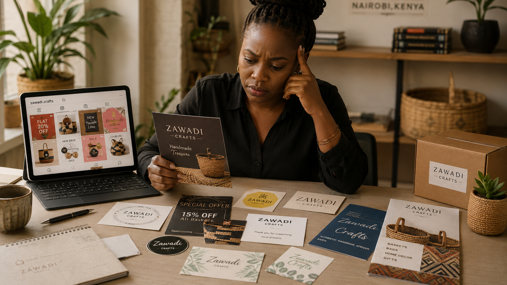
The Instagram posts use one style. The website uses another. The business card looks different from the invoice. The team keeps choosing random colors. The logo looks good, but the brand still feels unclear, inconsistent, or unfinished.
That is because a logo is not the same as a brand identity.
A strong brand identity gives your business a clear, consistent way to look, sound, and be remembered. It helps customers understand who you are, what you offer, and why they should trust you.
For a small business in Kenya, especially one growing through referrals, social media, WhatsApp, Google, events, or a physical location, brand identity is not just decoration. It is part of how people decide whether your business feels serious, credible, and worth choosing.
What Is Brand Identity?
Brand identity is the full system that shapes how your business presents itself to the public.
It includes your logo, colors, fonts, design style, photography style, tone of voice, messaging, social media templates, website look, brand guidelines, and the overall feeling people get when they interact with your business.
In simple terms:
Brand identity is how your business looks, sounds, and feels consistently across every touchpoint.
It helps people recognize you whether they see your signboard in Nairobi, your product packaging in a shop, your Instagram post, your website, your proposal, or your WhatsApp catalogue.
A strong brand identity answers questions like:
What should our business look like?
What colors and fonts should we use?
How should our social media posts feel?
What kind of language should we use?
How do we make our brand look consistent everywhere?
How do we help customers remember us?
Logo vs Brand Identity: What Is the Difference?
A logo is a visual mark that represents your business.
A brand identity is the wider system that supports recognition, consistency, and trust.
Think of the logo as the face of the business. Brand identity is the full personality, appearance, voice, and behavior behind that face.
A good logo can help people recognize you. But it cannot do everything alone.
For example, a restaurant may have a beautiful logo, but if the menu design, packaging, staff uniforms, Instagram posts, and signage all look unrelated, the brand still feels disorganized.
A school may have a crest, but if its website, prospectus, event posters, and parent communication all use different styles, parents may quietly question its professionalism.
A startup may have a smart logo, but if its pitch deck, website, app interface, and LinkedIn posts do not feel connected, the brand may look less established than it really is.
The logo is important. But the identity system is what makes the brand feel complete.
Brand Strategy vs Brand Identity
Before designing the visual identity, it helps to understand brand strategy.
Brand strategy is the thinking behind the brand.
It defines who the business is for, what the business stands for, what makes it different, and how it should be positioned in the market.
Brand strategy answers questions like:
Who are we serving?
What problem do we solve?
Why should customers choose us?
What do we want to be known for?
Are we affordable, premium, friendly, expert, bold, traditional, modern, or community-driven?
How should people feel after interacting with us?
Brand identity then turns that strategy into a visible and usable system.
For example, a premium skincare brand in Kenya may need a calm, clean, elegant identity with refined typography and soft colors. A youth-focused fashion brand may need a bolder, more expressive visual style. A law firm may need a more restrained, trustworthy, and formal identity.
Without strategy, design becomes guesswork. Colors are chosen because someone likes them. Fonts are chosen because they look nice. The logo may look attractive, but it may not match the audience, offer, or positioning.
A strong brand identity starts with clear thinking.
Visual Identity: The Look of the Brand
Visual identity is the visual part of brand identity.
It includes the design elements people see when they interact with your business.
This may include:
Logo
Brand colors
Typography
Graphic patterns
Icon style
Photography style
Illustration style
Layout style
Social media design
Packaging design
Business cards
Signage
Website visuals
Presentation templates
Visual identity helps your business become recognizable.
For example, when someone sees your brand colors, layout style, or social media template, they should slowly begin to associate that look with your business.
This matters because people are often exposed to your brand many times before they decide to buy. They may first see your Instagram post, then visit your website, then receive a quote, then check your Google profile, then message you on WhatsApp.
If each touchpoint feels connected, the business feels more professional and trustworthy.
Brand Guidelines: The Rules That Keep the Brand Consistent
Brand guidelines are the instructions for how to use your brand identity.
They help you, your team, your designer, your social media manager, your printer, and your website developer use the brand correctly.
A simple brand guideline document may include:
Logo versions
Logo spacing rules
Logo misuse examples
Brand colors
Font choices
Typography hierarchy
Image style
Icon style
Tone of voice
Social media examples
Document layout examples
Brand guidelines are especially useful when more than one person is creating materials for the business.
Without guidelines, every new design becomes a new interpretation. One person uses a different orange. Another uses a random font. Another stretches the logo. Another creates posters that do not match the website.
Over time, the brand becomes messy.
Brand guidelines reduce confusion. They make consistency easier.
Tone of Voice: How the Brand Sounds
Brand identity is not only visual. It is also verbal.
Tone of voice is how your business communicates through words.
It affects your website copy, social media captions, WhatsApp messages, emails, proposals, brochures, adverts, and customer communication.
A brand can sound:
Warm and friendly
Formal and professional
Bold and energetic
Calm and reassuring
Educational and helpful
Premium and refined
Youthful and playful
The right tone depends on the audience and the nature of the business.
A children’s school should not sound like a corporate bank. A legal consultancy should not sound like a fashion influencer. A medical clinic should communicate with clarity, care, and trust. A creative studio can sound more expressive, but still professional.
Tone of voice helps people feel the personality of the business.
It also improves clarity. When your business knows how to speak, your content becomes easier to write and your message becomes easier to understand.
Brand Colors: More Than Decoration
Colors are one of the most visible parts of a brand identity.
They influence recognition, mood, and perception.
But brand colors should not be chosen randomly.
A small business may choose blue because “blue looks professional,” or gold because “gold looks premium.” Sometimes that works. But the better question is: What should this brand communicate, and what colors support that feeling?
For example:
Blue can suggest trust, structure, calm, or professionalism.
Green can suggest growth, health, nature, or freshness.
Black can suggest elegance, seriousness, or sophistication.
Orange can suggest energy, creativity, warmth, or confidence.
Soft neutrals can suggest calm, simplicity, or refinement.
A strong color system usually includes:
Primary brand color
Secondary colors
Neutral colors
Background colors
Accent colors
Usage rules
The goal is not to use many colors. The goal is to use the right colors consistently.
Typography: The Fonts That Shape Your Brand’s Personality
Typography is the style of text your brand uses.
It affects how professional, modern, friendly, serious, or premium your business feels.
A font can make a brand feel corporate, playful, elegant, traditional, modern, bold, or casual.
Typography usually includes:
Heading font
Body text font
Accent font, if needed
Font sizes
Font weights
Spacing rules
Usage examples
Good typography also improves readability.
This matters on websites, menus, brochures, school prospectuses, social media graphics, and proposals. If your text is hard to read, people may not stay long enough to understand your offer.
For small businesses, typography is often overlooked. But it is one of the fastest ways to make a brand look more organized and mature.
Brand Consistency: Why It Matters for Trust
Brand consistency means your business looks and sounds connected across different platforms.
Your website, social media pages, signage, packaging, proposals, invoices, and presentations should feel like they belong to the same business.
Consistency matters because people may not notice it consciously, but they feel it.
When a business is consistent, it feels more serious. More stable. More reliable.
When a business is inconsistent, it can create doubt.
A customer may think:
Is this the same business?
Are they professional?
Do they pay attention to detail?
Can I trust them with my money?
Are they established or still figuring things out?
This is especially important in Kenya, where many customers discover businesses through social media, referrals, Google Maps, WhatsApp, events, and word of mouth. People often check multiple touchpoints before deciding to buy, visit, call, or book.
Your brand identity should help them feel confident at every step.
What Should Be Included in a Small Business Brand Identity?
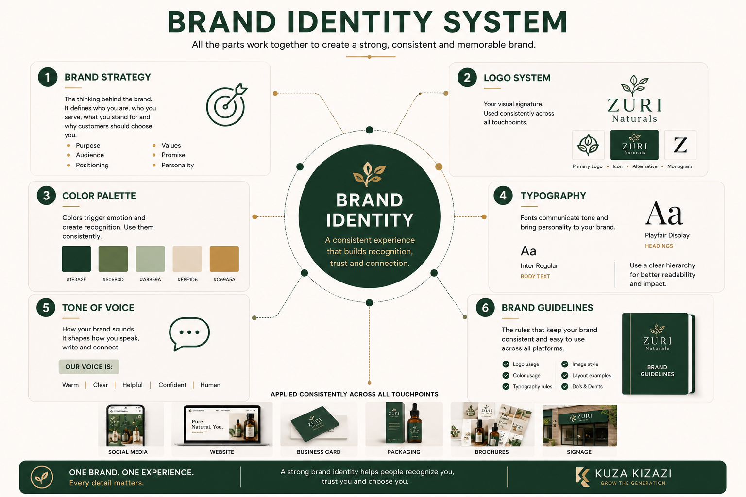
A basic but useful brand identity package should include:
1. Brand Strategy Foundation
This does not have to be complicated, but it should be clear.
It may include:
Target audience
Business positioning
Brand personality
Key message
Value proposition
Competitor direction
Brand goals
This helps the design choices make sense.
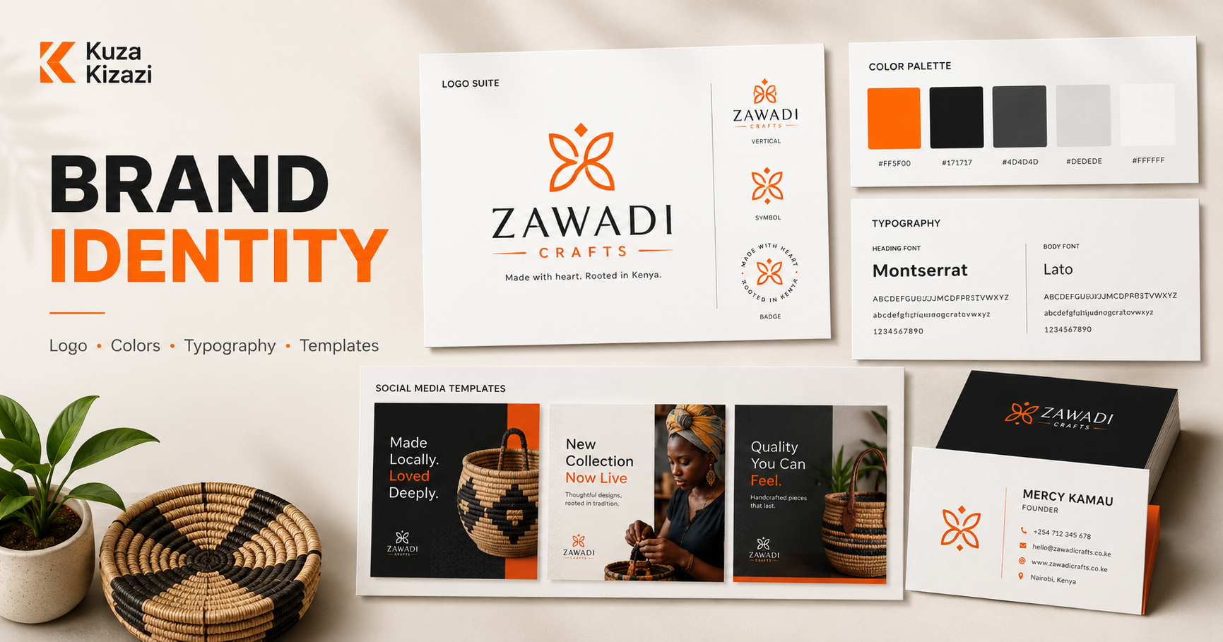
2. Logo System
A complete logo system may include:
Primary logo
Secondary logo
Logo icon or mark
Horizontal version
Vertical version
Black and white versions
Light and dark background versions
This gives the business flexibility across different uses.
3. Color Palette
The color palette should include:
Primary color
Secondary colors
Neutral colors
Accent colors
Color codes for print and digital use
This keeps designs consistent.
4. Typography System
This should define:
Heading font
Body font
Supporting font styles
Basic hierarchy
This makes documents, websites, and social posts easier to design.
5. Visual Style Direction
This may include:
Photography style
Icon style
Illustration style
Graphic patterns
Layout examples
Social media style
This helps the brand feel consistent beyond the logo.
6. Tone of Voice
This should explain how the brand should speak.
For example:
Clear and professional
Warm and helpful
Bold and confident
Simple and educational
Formal and trustworthy
It can also include words to use and words to avoid.
7. Brand Guidelines
Brand guidelines bring everything together into one document.
They help anyone working on the brand make better design and communication decisions.
8. Brand Applications
These are sample materials that show the identity in real use.
They may include:
Business card
Letterhead
Invoice design
Social media templates
Presentation cover
Email signature
Packaging mockup
Website homepage direction
Signage mockup
Applications help the business see how the brand works in real life.
When Is a Logo Enough?
A simple logo may be enough when the business is still testing an idea.
For example, you may only need a basic logo if:
You are testing a side hustle
You are not yet clear on your audience
You are validating a product
You have a very limited budget
You need something temporary before investing properly
You are not yet creating many marketing materials
At this stage, the goal is to look presentable and begin learning from the market.
But once the business starts growing, the logo alone often becomes limiting.
When Do You Need a Full Brand Identity?
You need a fuller brand identity when:
You are serious about growth
You are launching publicly
You are rebranding
You are building a website
You are creating regular social media content
You are printing marketing materials
You are opening a physical location
You are pitching investors or partners
You are hiring a team
You want to look more established
Your current brand feels inconsistent
Customers struggle to understand what you offer
A full brand identity saves time because you no longer have to make every design decision from scratch.
It also helps your business look more prepared, credible, and memorable.
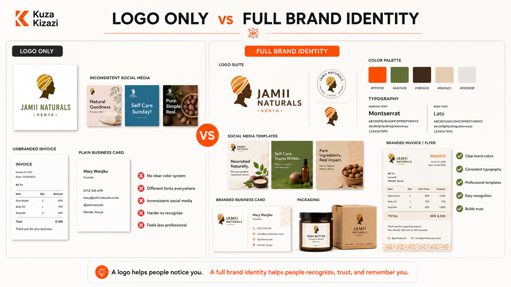
Example: Logo Only vs Full Brand Identity
Imagine a small bakery in Nairobi.
With only a logo, the bakery may have:
A logo file
Random Instagram post designs
Different menu layouts
Packaging stickers that do not match
Unclear photography style
No fixed color system
No consistent captions or messaging
With a full brand identity, the bakery may have:
A logo system
Warm brand colors
Clear typography
Packaging style
Menu design
Instagram templates
Photography direction
Tone of voice
Signage direction
Brand guidelines
The difference is not only visual. The second bakery feels easier to recognize, easier to trust, and easier to remember.
That is the value of identity.
Brand Identity for Kenyan Small Businesses: What to Consider
Kenyan businesses often operate across many touchpoints at once.
A customer may see your business on Instagram, ask a friend about you, check your Google profile, message you on WhatsApp, visit your shop, then ask for a quotation.
Your brand identity needs to work across all those moments.
Here are a few practical realities to consider.
Many Customers First Meet You on Social Media
Your social media should not look disconnected from your website, shop, packaging, or printed materials.
Consistent templates, colors, fonts, and image styles help customers recognize your posts quickly.
WhatsApp Is Often Part of the Sales Process
For many SMEs, WhatsApp is where inquiries happen.
Your catalogue, profile image, status graphics, message tone, and shared PDFs should still feel branded.
Print Still Matters
Business cards, brochures, menus, banners, packaging, uniforms, and signage still play a strong role in many Kenyan businesses.
Your identity should work both online and offline.
Trust Is Built Before the First Conversation
Customers often judge professionalism before they contact you.
A clear brand identity can help your business look organized before you ever speak to the customer.
Budgets Require Prioritization
Not every small business needs a large brand system immediately.
But every serious business should at least have the basics: logo system, colors, typography, visual direction, and simple usage rules.
Common Brand Identity Mistakes Small Businesses Make
1. Treating the Logo as the Whole Brand
The logo matters, but it is only one part of the identity.
A business can have a good logo and still look unprofessional if the rest of the system is weak.
2. Choosing Colors Based Only on Personal Taste
The owner may love purple, green, or gold. But the question is whether the color supports the brand personality, audience, and positioning.
Personal taste should not be the only strategy.
3. Using Too Many Fonts
Too many fonts make a brand look messy.
Most small businesses only need one or two strong typefaces used consistently.
4. Copying Competitors
It is useful to study competitors, but copying their style makes your brand harder to remember.
A good identity should help you stand apart while still fitting your industry.
5. Ignoring the Website
A brand identity should not only look good on a logo mockup. It should work on your website, mobile screens, social media, and documents.
6. Designing Without Understanding the Audience
A brand for parents, corporate clients, teenagers, donors, or luxury buyers should not look and sound the same.
Audience matters.
7. Not Creating Guidelines
Without guidelines, consistency depends on memory. That becomes difficult as the business grows.
8. Rebranding Too Often
Changing your brand every few months can confuse customers.
A good identity should have enough flexibility to grow without constantly starting again.
Brand Identity Checklist for Small Businesses in Kenya
Use this checklist before launching or rebranding your business.
Brand Foundation
Do we know who our ideal customer is?
Do we know what problem we solve?
Do we know what makes us different?
Do we know what we want to be known for?
Do we have a clear brand personality?
Logo System
Do we have a primary logo?
Do we have a simplified logo version?
Do we have versions for dark and light backgrounds?
Does the logo work on social media, print, signage, and mobile screens?
Visual Identity
Do we have defined brand colors?
Do we have defined fonts?
Do we have a clear photography or image style?
Do our social media posts look connected?
Do our documents look professional?
Voice and Messaging
Do we know how our brand should sound?
Is our website copy clear?
Are our captions consistent with our brand?
Can customers quickly understand what we offer?
Brand Guidelines
Do we have simple rules for using the logo?
Do we have color codes?
Do we have typography rules?
Do we have examples of correct and incorrect usage?
Can a designer, team member, or printer follow our brand system easily?
Business Touchpoints
Does our website match our brand?
Does our Instagram or Facebook page match our brand?
Does our WhatsApp profile look professional?
Do our proposals and invoices look branded?
Do our printed materials feel consistent?
How to Build a Brand Identity Step by Step
Step 1: Clarify the Business
Start with the business itself.
What do you sell? Who do you serve? What problem do you solve? Why should people trust you?
Do not rush into visuals before answering these questions.
Step 2: Understand the Audience
A brand identity should be designed for the people you want to reach.
A youth fashion brand, a real estate company, a school, a salon, a logistics company, and a consulting firm all need different identity choices.
Step 3: Define the Brand Personality
Choose a few words that describe how the brand should feel.
For example:
Friendly
Premium
Bold
Calm
Professional
Creative
Reliable
Modern
Traditional
Caring
These words guide the design direction.
Step 4: Create the Logo System
Design a logo that is simple, flexible, and relevant.
Avoid logos that are too complicated, too trendy, or difficult to use at small sizes.
Step 5: Choose Colors and Typography
Create a practical visual system.
The colors and fonts should support the brand personality and work across digital and print materials.
Step 6: Define the Visual Style
Decide how the brand should look in real use.
This includes photography, graphics, layouts, icons, social media templates, and website direction.
Step 7: Define the Tone of Voice
Create simple guidance for how the brand should communicate.
This makes website copy, captions, emails, and customer communication more consistent.
Step 8: Create Brand Guidelines
Document the system.
Even a simple guideline document is better than leaving everything to guesswork.
Step 9: Apply the Identity Across Touchpoints
A brand identity becomes useful when it is applied.
Update your website, social media, business documents, signage, packaging, proposals, and other materials.
Step 10: Review and Improve Over Time
Brand identity should be stable, but not frozen.
As the business grows, you may refine the system, improve templates, update messaging, or expand the guidelines.
Kuza Kizazi Perspective
At Kuza Kizazi, we see brand identity as a practical growth system, not just a design exercise.
A logo can help people recognize your business. But a full identity helps them understand, trust, and remember you.
For growing African brands, the goal is not to look expensive for the sake of it. The goal is to look clear, credible, consistent, and aligned with the business you are building.
A strong identity makes everyday communication easier. Your website becomes clearer. Your social media becomes more consistent. Your documents look more professional. Your team makes better design decisions. Your audience starts to recognize you faster.
That is why small businesses should think beyond “I need a logo” and start asking, “What kind of brand system will help people trust us and remember us?”
Final Thoughts
A logo is a good starting point, but it is not the full brand.
If your business is new, a simple logo may help you begin. But if you are serious about growth, visibility, credibility, and consistency, you need a stronger identity system.
A good brand identity helps your business show up clearly everywhere: online, offline, on social media, on your website, in proposals, in packaging, and in customer conversations.
The more consistently people experience your brand, the easier it becomes for them to recognize you, trust you, and choose you.
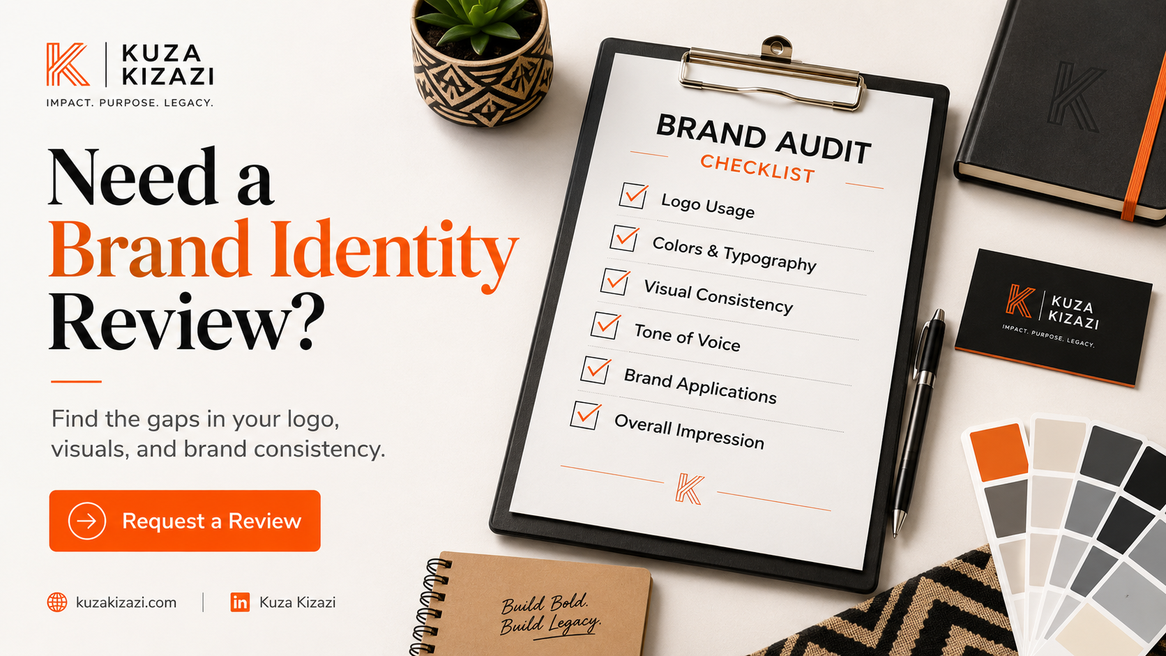
If your business has a logo but still feels inconsistent across your website, social media, documents, and marketing materials, Kuza Kizazi can help you build a clear brand identity system that supports trust, visibility, and growth.
Start with a brand identity review so you can see what is working, what feels disconnected, and what needs to be improved.
Comments
Loading comments…